Project Summary
Overview
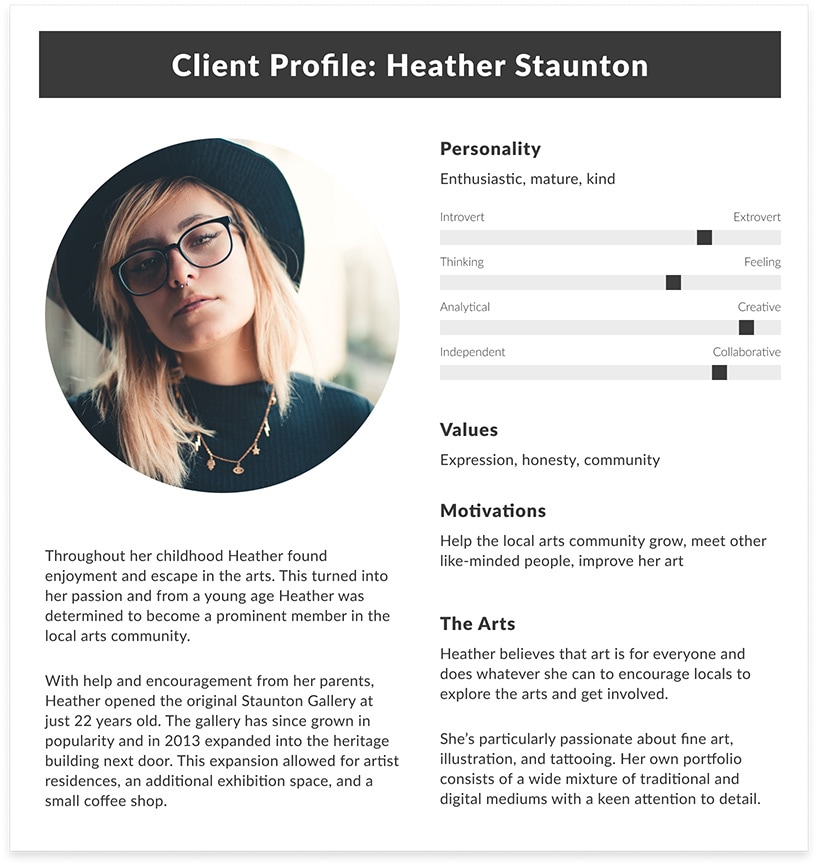
Staunton Gallery is a local art gallery situated in the heart of Subiaco featuring multiple exhibition spaces. The gallery curates and hosts exhibitions, provides a support network to associated artists, and houses artist studios. Heather Staunton has been operating the gallery as an independent artist since 2007 and is seeking to reimagine the galleries online presence with a brand new website.
The website design must showcase the venue, their exhibitions, artists, and history, while also providing their clientele with information regarding upcoming events. The design must reflect the creative nature of the gallery, appeal to their existing customer base, and seek to attract a younger audience.
Project Status: Development
This is a fictional brief, further details at the end of this page
Staunton Gallery wants to reimagine their online presence with a brand new website that reflects the creative nature of the gallery in a professional, yet aesthetically pleasing manner.
The design must showcase the venue, their exhibitions, artists, and history, while providing information on upcoming events.
Project Goals
 Create an aesthetically pleasing design that leverages white space to convey the 'feeling' that the user is browsing through a physical gallery
- Feature artworks and photography as key structural elements of each page, creating an editoral style design
- Utilise subtle animations to engage users
- Strategically plan page navigation to limit clicks and encourage engagement
The Solution
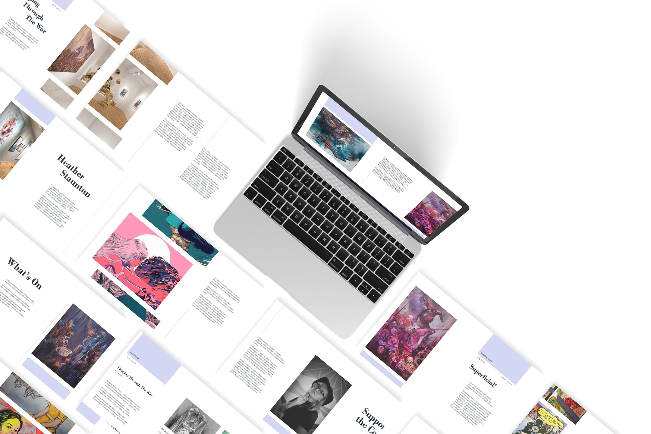
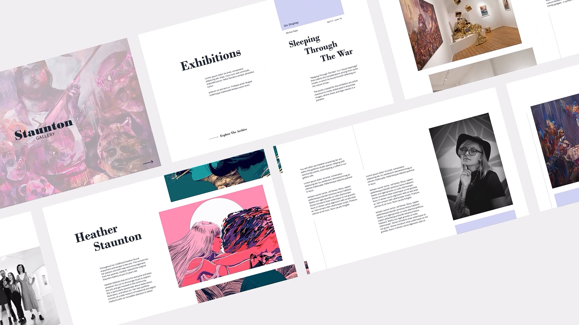
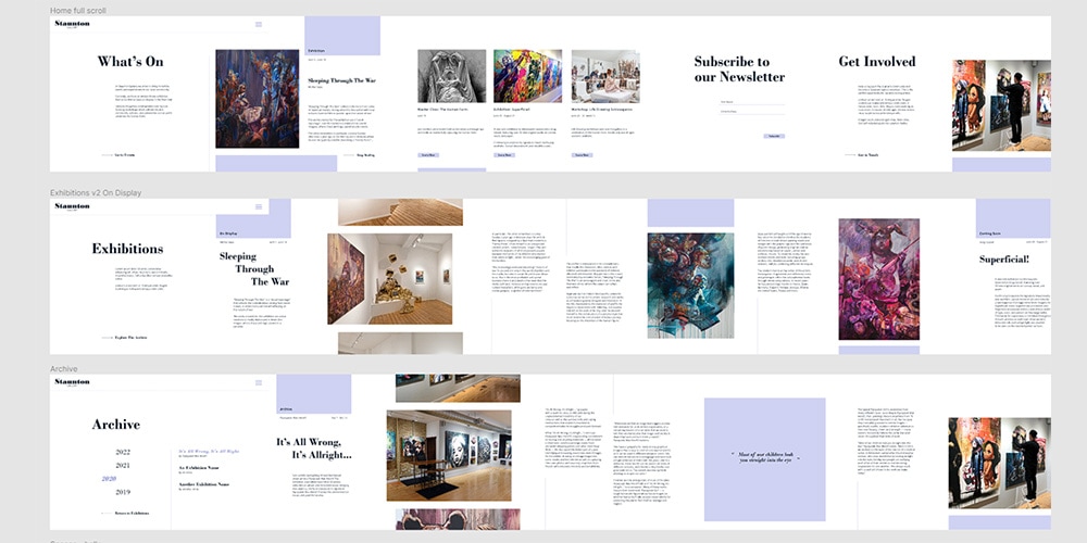
Featuring a soft colour palette, asymmetrical layout, and geometric colour blocks, the final design is a unique and modern website that's easy to navigate and pleasant to browse. The minimalistic design accomodates the needs of older users, while the subtle animations and clean, editorial style design simultaneously appeals to a younger audience.
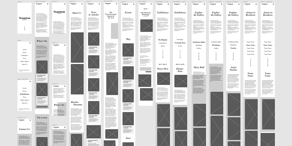
The final design is fully responsive, with careful consideration given to layout adjustments made for mobile devices.
research
To understand the needs of the project brief I initially conducted topic research focusing on understanding what artist studios and resident artists are. I also researched other small art galleries found throughout Perth, analysing their online presence including social media pages.
I discovered that small art galleries typically feature raw and unfinished materials in their buildings, imperfections that give these spaces a relaxed and inviting atmosphere
“Many young people do not feel at home in art galleries or are inhibited from visiting them by the very way in which these institutions collect and display art” (Mason, 2006)
Competitor Analysis
Based on my analysis of art galleries from around the world I discovered that there's a tendency to present a plethora of information to the user at any given moment. White space is used in an attempt to give this content space to breathe, but the contrasting colours and photography can quickly cause overwhelm. Notably, Frans Hals Museum has an incredibly unique and creative website that features microinteractions, playful colours, and huge typography that engages users.
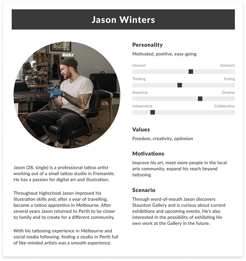
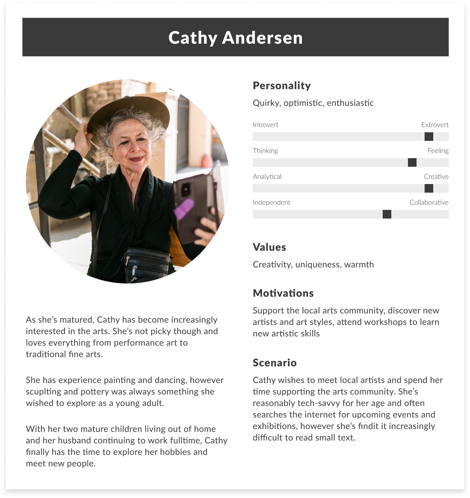
User Research
Initial user research revealed that although art is enjoyed by people of all ages and genders, those that typically browse art galleries tend to be more educated, well-paid, and professional. I also uncovered interviews suggesting that young people believe that art galleries are uninviting, silent, and cold.
ideation & wireframes
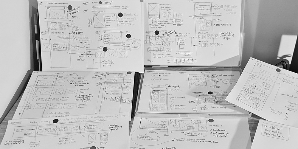
Initial stages of ideation involved multiple quick brainstorms, followed by extensive sketching of a range of concepts aiming for a high quantity of potential website layouts. To help filter through the options I used red and green sticky dots to vote for a design element.
I then created low-fidelity mockups in Figma to visualise these chosen sketches.
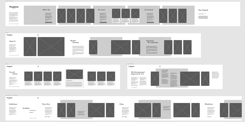
high-fidelity mockups
From the initial wireframes I created high-fidelity mockups that feature parallax animation. Ultimately I decided to remove this as, while this parallax animation looked interesting and unique, it didn't serve to enhance the artworks or photography on display.
Upon removal of the large background images I opted to include more of the brand colour in the design, choosing to strategically add colour blocks to various sections of the design. These blocks of colour add to the structure of the website and an element of interest without taking away from the incredible artworks on display.
Click through to the Figma Design to explore the design iterations and responsive variations.

This is a fictional brief. This project has been created as part of an assignment in an approved course of study for Curtin University and contains copyright material not created by the author. All copyright material used remains copyright of the respective owners and has been used here pursuant to Section 40 of the Copyright Act 1968 (Commonwealth of Australia). No part of this work may be reproduced without consent of the original copyright owners.
References
Mason, David. 2006. "'The feeling of exclusion': Young peoples' perceptions of art galleries." Museum Management and Curatorship 21 (1): 20-31. https://doi.org/10.1016/j.musmancur.2005.11.002.